Anthropic shipped a beta feature on March 12 that lets Claude generate interactive charts, diagrams, and visualizations right inside the chat thread. No side panel, no extra steps. The AI decides when a visual would help and drops it inline, or users can request one with prompts like "draw this as a diagram." Anthropic detailed the feature on its product blog.
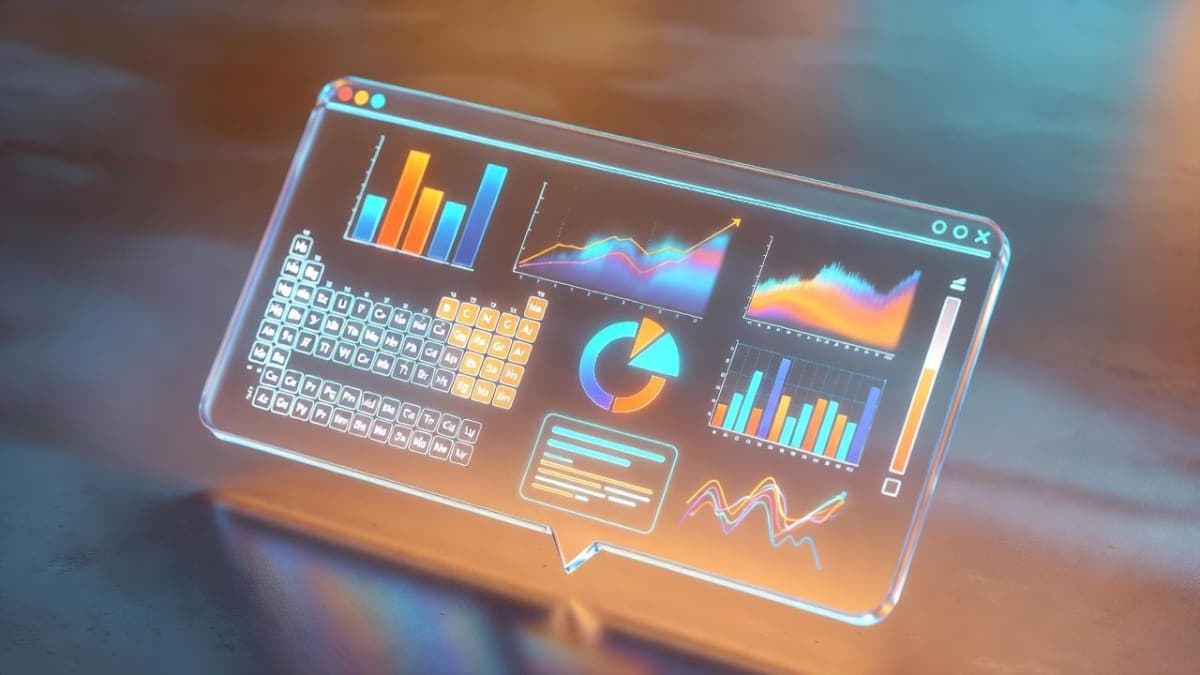
These aren't images. Claude builds the visuals using HTML and SVG code, which Anthropic compares to giving the model its own whiteboard. The visuals are temporary and evolve as the conversation continues, which separates them from Claude's existing artifacts feature, where outputs persist in a side panel for sharing or downloading. Ask about compound interest and you get a draggable curve. Ask about the periodic table and you get clickable elements with pop-up details.
The feature grew out of "Imagine with Claude," a preview Anthropic ran briefly in fall 2025 that let subscribers generate UIs on a virtual desktop in real time. This is a scaled-down, more focused version of that experiment, embedded directly into conversation flow. It works on web and desktop but not mobile yet.
Timing matters here. OpenAI rolled out its own "dynamic visual explanations" in ChatGPT just days earlier, though that feature targets math and science students specifically. Google launched similar interactive visuals for Gemini Ultra subscribers back in December, but at $200/month. Anthropic is making its version available on all plan types, including free.
Early testing by The New Stack found the visuals mostly accurate but not flawless: an aviation traffic pattern diagram had a mislabeled entry point. Accuracy on complex technical diagrams remains the open question.
Bottom Line
Claude's inline visualizations are available now in beta on all plans, including free, on web and desktop.
Quick Facts
- Launch date: March 12, 2026
- Availability: all plan types, including free tier
- Platform: web and desktop (not mobile yet)
- Status: beta
- Built with: HTML and SVG (not image generation)
- Precursor: "Imagine with Claude" preview, fall 2025